Email best practices
4 ways to design a newsletter that people will actually read
Email newsletter templates are great, but a bespoke design might be just what you need. Find out how to create your own newsletter in four easy steps.
PUBLISHED ON
What if we told you that 42% of people prefer to hear from brands by subscribing to their newsletters? That’s in the top three preferred channels, only behind direct to website and social media.
So how are they doing this? And how do you design a newsletter anyway? Well, that’s what this article will be all about. But first, let’s get back to the basics.
Table of content
1. Clearly defined newsletter format dimensions
2. Organize your layout
3. Master your headers and footers
4. Add CTAs and social links
1. Choose fonts and colors
2. Add imagery
3. Define content
What is an email newsletter?
An email newsletter is a fantastic tool that tells current and potential clients about anything going on with your brand or business. Maybe you’ve got an exciting event approaching, or you’re launching new products. Or perhaps you have a promotion, sale, or accomplishment worth sharing. Your newsletter can be the mouthpiece you need to spread the word.
Sure, it’s a common understanding that social media does wonders for today’s advertising and marketing efforts. However, the numbers don’t lie; they show that consumers spend 46.7% more time reading email newsletters than on social media platforms like Facebook. Plus, the time users spend on social media is passive. Even if individuals see your marketing campaigns on Facebook, they may not internalize your brand message or click through to your website.
How to design a newsletter?
Whether you use newsletter email templates or plan to create your own company newsletter, figuring out your web design language is no simple feat.
Figuring things out, like what colors and images to use, module placement, and whether or not to include links to multimedia content can be exhausting. Lucky you, though, because we’re here to help you get set up.
1. Clearly defined newsletter format dimensions
When designing the perfect email newsletter, theformat is king. Set a width between 550-600 pixels. Then place any desired focal points, like crucial information or a hero photo, squarely within the 300-500 pixel mark. This range captures the average size of the preview window for most desktop email clients. People can see this focal point before opening the email.
2. Organize your layout
Settling on your newsletter layout ideas can be overwhelming because so many options exist.
Some quick layout tips:
Avoid walls of text
Use white space to your advantage
Choose graphic elements that contrast the background
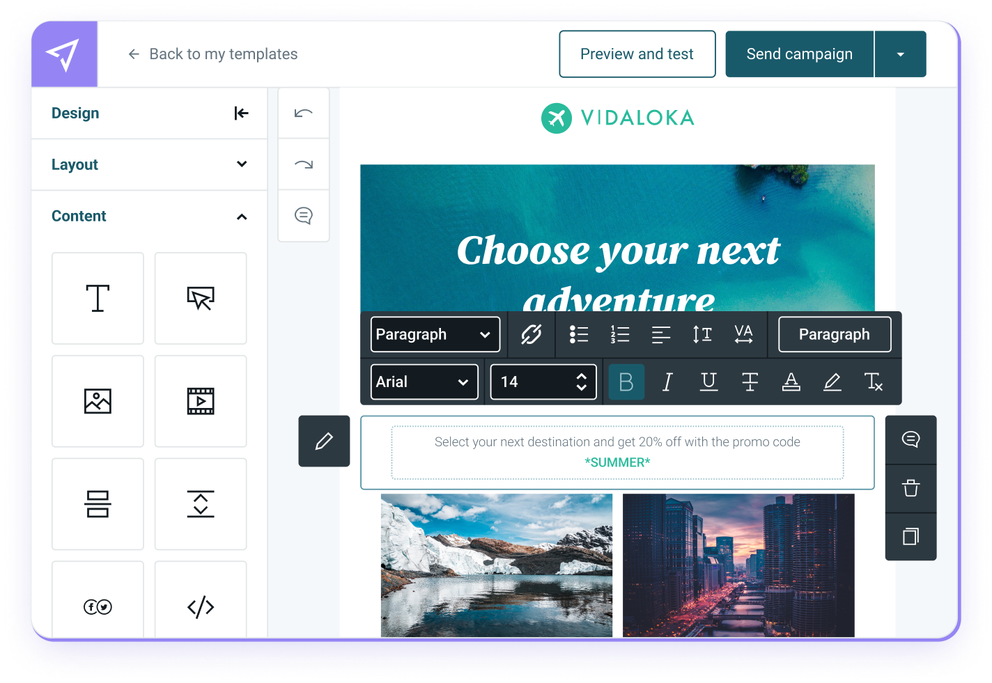
When you don’t have the resources to create your own template, you can rely on our template gallery and tweak your favorite to suit your style.
3. Master your headers and footers
Your headers are the first impression of your newsletter while the footers carry important information and opt-out options. Together, they sandwich your newsletter together.
Headers
Your headings should project your brand’s identity and values. If you’re a beginner, don’t overcomplicate the process regarding newsletter design ideas. Use a prominent color palette (more on this in a moment) and a contrasting one for the font and social links. And don’t forget your logo!
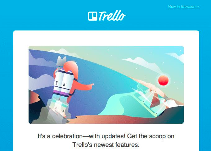
Trello’s simple and fun email header.
Footers
These round out the reader’s experience with your email newsletter’s design. Today’s reader gets inundated with email content and expects certain things from the content they interact with. One such norm is that they can find brand contact information, social media links, and sometimes a street address in the footer of an email or digital newsletter.
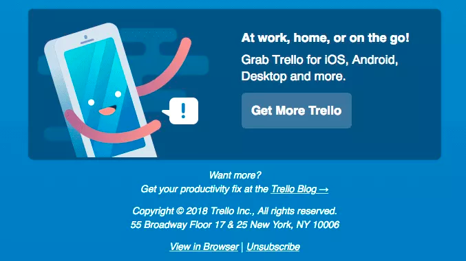
Contact information makes your email more legitimate.
4. Add CTAs and social links
You might be sending this newsletter as a way to generate results. Or maybe you’re optimizing your newsletter to grow your customer base. Or perhaps it’s to spread the word about future live events. Regardless of your reasoning, email recipients expect to see a call-to-action (CTA) button and social network icons in the emails they receive.
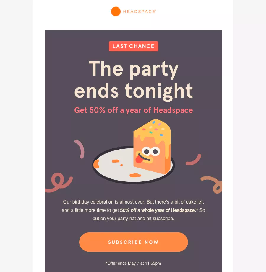
Keep your links to a minimum to keep your reader on track.
What are other email newsletter design essentials?
Once you’ve taken care of the suggestions we’ve shared, you might want to dive into the following three newsletter design tips to kick things up a notch.
1. Choose fonts and colors
There are only so many things you can do to brand yourself online, and fonts are one of the best ways. Choosing fonts can feel like a mystery, but finding the right font that’s either as quirky or no-nonsense as your business will project the qualities that your brand represents.
Establishing a color scheme highlights the look and feel of your brand. To use these design elements effectively, you can lean on color theory to convey the right kind of emotions in the choices you make in your branding and design.
2. Add imagery
Consider how much your audience sees imagery across mobile devices and social media platforms. Because of this, we recommend being selective with the imagery you use. Using the right photos can enhance your overall design. On the other hand, the wrong image or using too many might make your brand seem less approachable.
While using your own images can rack up your costs, it’s better than using stock photos. The latter can cheapen your design and, by proxy, your business.
If you’re not the photographer type, consider infographics, which are an excellent opportunity to add more data to the mix.
3. Define content
In design, consistency is critical. Any assets you use for your content should flow together and work cohesively across all public-facing work. The color, font choices, and imagery should gel together in every email iteration, such as your monthly newsletter.
So how can you keep track of all these choices you’re making? One of the easiest ways to maintain brand consistency is by using templates. Whether using ones from Mailjet’s gallery or creating your own, you’ll save time. Templates allow you to upload the same newsletter header, footer, imagery, and more across all communications with your audience.
For a cheat code, check out our 50 newsletter ideas to create engaging emails.
Wrapping up: What tools can you use?
Ready to get started? We invite you to design a beautiful email newsletter using Mailjet’s Email Editor. Take everything we’ve taught you in this article, throw it into a template, and you’re good to go.
We hope you come away from this article armed and ready to drive up your KPIs, from your click-through rate (CTR), nudging more traffic to your landing page, increasing sign ups, and lowering your unsubscribers and bounce rate.
The bottom line – you want your email list subscribers to know who your newsletter is from as quickly as possible, so they recognize it and want to open it.
One of the most efficient ways to do this is by making your design memorable. So get creative, write great subject lines, trust your digital marketing instincts. What are you waiting for? It’s time to get to it!
