Email Best Practices
Email design tips for a successful business email marketing strategy
Find out how to create beautifully designed email campaigns that will contribute to a successful marketing strategy. Learn now from expert designers' tips.

PUBLISHED ON
These creative design tips put together by the design platform 99designs assist businesses and startups of any size to enhance marketing strategies by email considerably.
The popularity of email marketing is increasing by leaps and bounds. Many small to medium-sized businesses now devote a major slice of the marketing budget to email campaigns. Email is a very effective way of facilitating direct contact with your existing customers as well as developing better relationships with prospects or leads.
Email correspondence allows any business to customize information and send quotes, business updates or promotions rapidly. This kind of interesting and useful information will lead to increased website traffic and conversions for your business. The growth of email as a major sales and marketing tool means that it is imperative to adopt a meaningful email design and message. Your customers and prospects must easily be able read and absorb information provided, which will create a better overall user experience for your audience.
Table of content
1. Photos/Images
2. Colors
3. Graphics
4. Drawings
5. Typography
6. Minimalism is key
7. Logo
Seven of the top creative tips to enhance your email marketing techniques:
1. Photos/Images
Nothing beats expressive, high-quality images when it comes to grabbing customer attention on the Internet. Images are far more effective than long texts as potential customers will not need to spend too much time or attention absorbing the information provided. Presenting your brand image and character visually can often trigger powerful buying emotions. You should also label or describe each photo with optimized text (Alt text) to enhance your email and impact on any potential search queries and search results conducted by your prospective customer. This text will also ensure readers get grasp of what the images represent, even if they don’t load properly on their emails.

Designed by Codeflex for Dmweissman
2. Colors
Boom! Bold use of bright, vibrant color can draw consumer attention and create an impact. If you want your email marketing messages to stand out and catch the eyes of your prospects, use of color psychology is another proven key to success. Color can be emotive, with certain colors, tones and shades trigger particular feelings and associations. It is important to consider your target audience and cultural influences when taking an approach of this nature, alongside remaining authentic to your overall brand image and message.

Designed by charlim888 for chrisFJr
3. Graphics
Adding eye-catching graphics are another important element for success with email marketing. Fun or interesting graphics will complement corporate design features and are likely to build more of a rapport with your customers. It’s a much quicker and more engaging way to communicate with your fanbase.
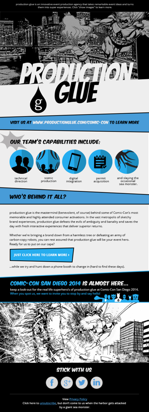
Designed by ScarlettaDesign for jstucey
4. Drawings
Adding attractive artwork to a marketing email impresses prospects and gives them a reason to continue following what you do. Providing drawings in addition to blocks of text, graphics, color and Calls to Action (CTAs) are key elements of making your content work in a digital environment. It adds personality to your emails and helps build and strengthen customer relationships. Customized artworks and drawings should be based on your brand and its values, so getting a talented designer to provide artwork of this nature is a winning formula that enhances any marketing campaign.
5. Typography
Different fonts in a range of sizes, colors and orientations provide opportunities to relay a good deal of information within the limited space of an email. Take time to play around with the structure and organization of all your marketing copy to find the layout that gives the best visual impact. It’s important to also balance this with readability and make sure it’s clear for your readers. Use of color within your text should complement the elements already discussed above at point 2 and help your customer build bonds and links with your brand and products offered.

Designed by Ruky
6. Minimalism is key
Irrespective of all your creative inputs, don't overwhelm your recipient with too much information. Sales and marketing emails need to be short and snappy, giving details with clarity and information that's easy to understand. This will make it easier for you to design your email for mobile (which is necessary because a big part of your subscribers will open their emails on a mobile device) and to create a great experience for your users on all kind of screens. Take time to review the details provided and ensure it is the minimum required to raise interest and that the layout is clean and crisp. This way your readers will soon recognize any Call to Action (CTA) and be far more engaged within the reading and information gathering process.

Designed by nirveshverma
7. Logo
Always include your company business logo at the top of any email. Your prospective customers and clients will soon learn to recognize the logo, which will create trust and enhance the process of initiating interactions.

Designed by moinu33cu
Compose your schemes for every email separately according to the type and destination of your email campaign focus and layout priorities, bearing in mind all the tips highlighted above. It won't be long before you are inspiring customers and prospects with your fresh and impressive email compositions and increasing the number of visits to your website and associated sales!
***
This post was written by Monique Zander, content marketer at 99Designs.


