Email Best Practices
Best email marketing campaigns to get inspiration
Not sure what to do for your next email marketing campaign? These examples and tips will give yout the inspiration you need to start sending.

PUBLISHED ON
So you’ve decided to get started on an email marketing campaign. Your computer is booted up, you’ve got your notebook opened beside you and you’re already to go… but where should you start? It’s a daunting task, but we have a couple great email examples for you to get you started.
Table of content
Subject line
Content
Timeliness
Responsive design
CTAs
Nike: Clean minimalism
PayPal: Enticing copy
Starbucks: Welcome them to the list
The Skimm: Milestone celebration
Tory Burch: The magic of GIFs
Trello: Clever CTAs
Microsoft: Interacting with your customers
Typeform: Re-engage
Cook Smarts: Classic Weekly Marketing Campaign
What is an email marketing campaign?
An email marketing campaign is simple in explanation, but can be difficult in execution. Essentially, an email marketing campaign is an email or series of emails that a business uses to communicate with their customers, trying to persuade them to interact with them and/or their product.
Both simple and hard all at the same time, right? Our top picks are going to help you out, so deep breath, get ready to take some notes, and let’s get into it.
What makes a good email marketing campaign?
There are a couple things to keep in mind when planning your email marketing campaign. Every campaign you send out should include these key elements.
Subject line
Subject lines are only a few characters, even less text than a Tweet, but they have the power to make or break your email marketing campaign. So how does something that small have so much power? Because it is the first thing your subscriber is going to see in their inbox, before they even open your email.
This is your chance to stand out in the inbox. Your subject line should be related to what your email is about, catchy and something your recipient can’t miss, but also true to your brand image. Oh, and do not fear the emoji! Adding emojis in the subject line can be that pop of color that draws your subscribers attention to your email first (and they’re super cute).
Content
Your customers signed up to receive your email marketing campaigns for a reason, and this is your time to deliver on it. The content of your emails should be relevant, and there should be plenty of value in them as well.
Sending offers like promo codes, exclusive content or suggestions for your subscribers are all great way to add value to your emails. Be careful not to make it too cluttered, though. Your message should remain skimmable and your customer should be able to get the big picture right after they open your email.
Timeliness
Picking the right time to send your email is a hard decision to make. Tuesdays and Thursdays are generally the best days to send out your campaigns, but choosing a day and time could depend on if your a B2B or a B2C brand, and what industry you are in.
Regardless of what your answer to that is, we know you want to land in the inbox at the time that’s going to get you the most exposure possible. Picking a date and time, and then being consistent with it, is just as important at the content itself.
Responsive design
With 59% of emails now being opened on mobile, you’ll want to pay attention to responsive design. What this means is making sure that your email looks just as good on your customer’s mobile device as it does on their laptop.
Our Passport email builder will ensure that the emails you create appear how they should in your customer’s inbox, no matter the device. There are also a couple best practices for responsive emails that you might want to check out before you get down to it.
While designing your email, keep in mind that content is king. This means that adding interactive and eye catching features like GIFs and photos, and paying attention to building a memorable design are important, but make sure it doesn’t outshine the content of your email. When it comes down to it, your content is what your subscribers signed up for in the first place, and you want to make sure your delivering on those expectations. No pressure, though.
CTAs
A CTA, or a call-to-action, just might be the most important part of your email. This is the reason behind your email; it’s what you want your customer to do once they open it up in their inbox.
Whether it’s a button to complete their purchase, follow you on social media, or head back to your website to continue exploring, your CTA should grab their attention. There are a lot of ways to make your CTA stand out from the rest of the email, color and size just being two of them.
You’ll also want to keep the placement in mind, putting at least one CTA above the fold. You want your customers to see it as soon as possible so they know what action they should take within your email.
Don’t forget about the copy that you write to accompany it. The words you choose can make or break a CTA. It has to be hard NOT to click on, and match your brand voice. Sound like a lot? We have some great examples coming up to get you started.
9 of the best email marketing campaign examples
Nike: Clean minimalism

The first thing that catches our eye is the beautiful minimalism of Nike’s marketing campaign. Minimal clutter, minimal text, but just enough to pull you in. A big logo at the top so you know it’s Nike, followed by a bold title that immediately informs you that Nike is about to show you exactly what you need to make this summer a good one. Finally, one simple line of copy that fits perfectly with Nike’s brand voice.
It’s a seasonal email that’s just in time for the summer. It invokes beachy vibes with the towels laid out on an almost sand-colored background. While the main CTA is geared towards men, they also give you the option to check out the kids' stuff too, in case the whole family needs to get ready for the summer!
PayPal: Enticing copy

If you’re looking for an example of good copy, look no further than PayPal’s email marketing campaign. Quick and witty, it goes right into the purpose of the email flawlessly. We all know what it’s like when you’re out with friends, and you’re trying to figure out the best way to split the bill. The relatability of PayPal’s copy makes it feel friendlier and warmer.
It’s the perfect set up for their CTA. You’ll want to click on it to find out how you’ll never have to engage in that awkward “who’s going to cover the bill” conversation. Further down in the email, in case the copy didn’t quite snag you, they have a graphic to show you just how easy it is to use.
Starbucks: Welcome them to the list

Welcome emails are a great way to say thank you to your subscribers for signing up to your email marketing campaigns. You got them, so now it’s time to wow them. And that’s exactly what Starbucks does with their welcome email by keeping it minimal, but still informative.
In the body of the email, the short and sweet text lets you know exactly what to expect from their future emails. If every email is as simple and digestible (no pun intended) as this one, you’ll be looking forward to their next email in your inbox.Sending out a welcome email like this is super easy with our Automation feature. Once someone signs up for your newsletter, Automation will make sure the welcome email is sent off to them right away.
Check out our definitive step-by-step guide to create your own email newsletter.
The Skimm: Milestone celebration

Milestones are an important part of life, just as they are an important part of brand and customer relations. Well… maybe not as much, but bear with me. Milestone emails are emails that are sent out when the subscriber has reached a certain goal or, in Skimm’s case, been a subscriber for two years.
This kind of email can make a customer feel appreciated. We all love to celebrate a special occasion, right? The best thing about this kind of anniversary email doesn’t require a subscriber to input any new information. With that milestone email, you can also include CTAs to get them back more involved with your brand, like social media.
Tory Burch: The magic of GIFs
GIFs are the closest we can come to the moving pictures in Harry Potter. But beyond that, they’re also a cool little addition to your email campaigns to really catch the eye of your customer. When opened, it’ll set your email apart from all the other text-based ones cluttering up the inbox.
Additionally, the implied exclusivity of the Tory Burch sale can make customers feel special and singled out. The “Private Sale” encourages the customer to take advantage of this opportunity.
Trello: Clever CTAs
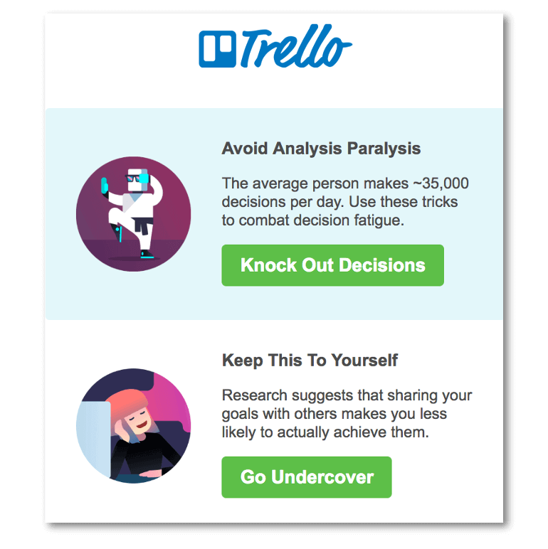
Because CTAs are so important to your email marketing campaign, it’s a good idea to make them hard to ignore. There are different ways to go about doing this, but the way Trello does is by writing witty copy for the CTAs. We all know the run-of-the-mill CTAs. The “click here” and the “learn more here” buttons that are the CTA equivalent of oatmeal for breakfast (no offense if you like oatmeal).
Accompanying Trello’s engaging copy are CTAs that are unique and fit with the little descriptions. It may be difficult and take quite a bit more brainpower, but avoiding the temptation to write boring copy of every aspect of your email, not just the CTAs, can really make your campaign stand out.
Microsoft: Interacting with your customers
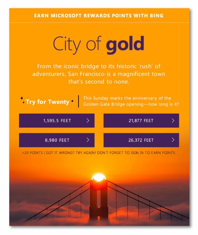
In this email campaign, Microsoft offered reward points if you answered the trivia question correctly. It’s like being on Who Wants To Be A Millionaire, but inside an email! And without the million dollar prize… but still exciting.
While it’s a fun way to engage the customer, offering points that they can then redeem for things like prizes and coupons will keep the customer involved. To get the points, the customer also has to sign into their account, pulling them back to the web page. It’s a quiz that their subscriber will actually want to take.
Typeform: Re-engage
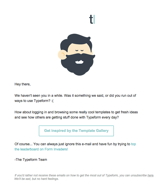
Email marketing campaigns can have many different uses, and one of those can be re-engagement. Maybe your subscriber was originally interested in your product, but life got in the way and they lost a bit of interest. Typeform’s re-engagement email shows you how to try to pull that subscriber back in.
At the beginning, they use a bit of humor to make the tone more conversational. Then, they give you a reason to come back to the site. In this case, it’s a link to the template gallery. A re-engagement email should both give the subscriber a reason to come back, as well as show them what they never knew they were missing.
Cook Smarts: Classic Weekly Marketing Campaign

Let’s just take a second to dissect this weekly newsletter.
Cook Smarts breaks down their email into three main sections to make the weekly reading a little bit easier to digest (get it?). Starting with the menu, Cook Smarts shows you the best of the week so you don’t have to do the digging yourself. They segway into kitchen how-tos, and then into the Tip of the Week. Easy to follow, and easy to see the value in remaining a subscriber of the weekly newsletter.
It’s also a great idea to have a CTA like “Forward to a Friend”, as this one does in the top corner. Emails are super easy to share by (you guessed it) email, so adding this sort ofCTA could boost exposure for your marketing campaign.
How to send great email marketing campaigns with Mailjet
Feeling a little overwhelmed with all of the possibilities? Your email marketing campaigns can take any shape or form you like, and your creativity and vision are your greatest asset. At Mailjet, we can give you the tools so you can flex your creativity:
Drag & Drop Email Editor: After seeing all the examples above, you have a vision for your email marketing campaign. It’s our intuitive email editor, Passport, that is going to help you bring it to life with drag-and-drop sections that lets you bring that vision to life. The best part: you don’t need to know how to code.
Segmentation: Every person is different, so marketing to them like they are all the same might not be the best way to go. This feature allows you to group your contacts into similar interests, demographics, or other criteria. More targeted sending = more engagement.
A/B Testing: Have an email hypothesis? Maybe you think a subject line with emojis will get more opens than one that doesn’t, but you want to test out your idea first. This is where A/B Testing comes in. It lets you test your hypothesis, and send only the best performing email to the majority of your contacts.
Personalization: Robots aren’t nearly as nice to talk to as humans. Personalization can catch your contacts attention, and make them feel like their valued by adding human touch to your email marketing.
Deliverability: If you’re sending emails, we’re guessing you want them to land in the inbox. Our great deliverability will help you get into your contacts inboxes, and your creative email marketing campaign will take it from there.
So you’ve designed your email, you’ve checked it for grammar and spelling errors (don’t forget to do this!), and you’re ready to send. We make sure your emails are responsive no matter what inbox they land in, or what device they’re viewed on.
When you’re building your campaigns, just keep in mind what your goal is. Do you want them to make purchases? Log back in? Give you more user information? Whatever the goal may be, build your CTAs, copy, and overall design to achieve it. Now take a deep breath… and get designing!
Is there an email campaign that stands out in your mind? If there is, let us know on Twitter.
